
Portfolio notes · Hanzi Ink
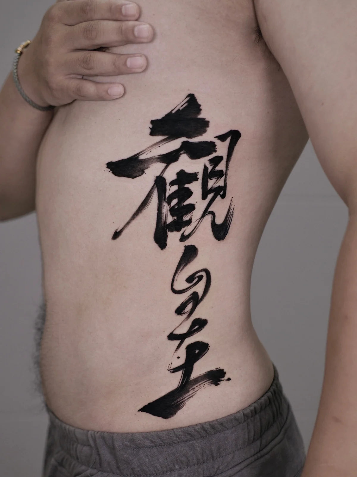
This side-body example uses a vertical line of calligraphy to follow the length of the torso. Its rhythm comes from differences in scale, the space between forms, and a broad finishing stroke—not from stacking identical characters at equal intervals.
How does the vertical layout work?
The upper portion has a wide, dense cluster of strokes. The forms below become more open, before the composition finishes with a broad sweep near the waist. That contrast creates movement along the body while leaving visible space between the main forms.
The design is not a rigid column. Strokes extend to either side of its central path, giving it more movement than a line of uniformly sized type.
Why spacing matters as much as the strokes
Open skin separates the darker parts of the composition. Those spaces help the individual forms remain visually distinct and prevent the entire piece from reading as one continuous black shape.
For a new design, review spacing at the intended tattoo size. A layout that looks balanced when enlarged on a screen may feel different when fitted to the side of a body.
What this photograph can—and cannot—show
This image is useful for studying the visible layout and brush edges in one pose. It does not establish how the piece looks from every angle, how it moves with the body, or its healed appearance. Those questions should be discussed separately with the tattoo artist.
For a similar placement, bring your intended dimensions and a placement reference to the design conversation. A shorter phrase may need a different arrangement rather than simply stretching its letters to fill the same space.
Should a Chinese tattoo be written vertically?
Vertical composition is one option, not a requirement for every Chinese tattoo. The choice should serve the wording and the body placement. Keep character order and the intended reading clear; do not rotate, mirror, or rearrange characters solely to make them fit a narrow area.
Before deciding on this visual direction, confirm the exact expression and its cultural context. This page discusses the photographed composition rather than assigning a personal story or an unverified translation to the wearer.
Start with the meaning. Then find your style.
Have Chinese characters or a reference image you want to understand? Request a free review of meaning, cultural fit, and tattoo suitability. For a new composition, tell us your idea through our custom design form.
Hanzi Ink provides digital calligraphy design files. Tattoo application is carried out by the tattoo artist you choose. These notes discuss the visible artwork; they do not claim a client's personal story or a healed result.